
This blog post enlists the 10 best landing page designs in 2023. These pages are all beautifully designed and effective at converting visitors. We’ll also discuss some key elements that make these landing pages successful.
Crafting a landing page that grabs attention and convinces visitors that your website is worth their time can be quite difficult. The components of an outstanding landing page design may vary depending on your specific goals, yet the essence lies in striking a balance between those elements.
Jump to:
10 Best Landing Page Designs of 2023
What is a Landing Page?
A landing page serves as a virtual storefront, a digital handshake that welcomes visitors to your online world. It’s a standalone page meticulously crafted to convert visitors into customers or subscribers. Just as a first impression matters in face-to-face interactions, a landing page’s design and functionality leave a lasting impression in the digital world.
Now, let’s explore some real-world examples of landing pages that have mastered this fusion. By dissecting their strategies and understanding how they resonate with the audience, you can glean insights to enhance your landing pages.
How do you ensure that your landing page holds your audience’s attention? How do you make them stay longer, read more, and possibly take that desired action?
Let’s find out!
You Might Also Enjoy:
The Ultimate Guide to Conducting a Google Ads Audit for your business
6 Tips For Running Real Estate PPC Campaigns Like a Pro
Create High Converting Google Ads Copy Using ChatGPT
10 Best Landing Page Designs of 2023
Why is your landing page not working? Is there a problem with the content? Or are the graphics not appealing to the visitors? All your questions lie in the following guide. Analyzing the landing page designs of the following top 10 brands, you’ll find the missing ingredient for your landing page.
1. Netflix
Do you know why Netflix seems so attractive besides ‘it got most of your favorite series’?
The use of Red and Black color themes. The combination of red and black is a classic color scheme often used to create a sense of attention-grabbing.
Moreover, combining red and black can also create a sense of urgency. Red is often associated with danger and excitement, making visitors feel they need to act quickly. This is a great way to encourage visitors to sign up for Netflix.
Let’s see how they used this powerful combination with great conversion content.
Netflix’s landing page is a masterclass in conversion. It’s simple, effective, and persuasive.
The headline is benefit-driven and attention-grabbing. By signing up for Netflix, it immediately tells visitors what to gain: “Watch anywhere. Cancel anytime.” The copy focuses on benefits, not features. This makes it more compelling and persuasive. For example, instead of saying, “Netflix has over 10,000 movies and TV shows,” the copy says, “Unlimited movies, TV shows, and more.”
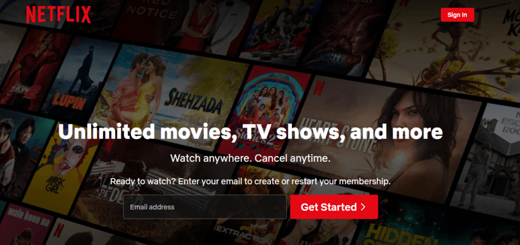
The call to action is clear and concise. The Big Red ‘Get Started’ Button is hard to miss. Simple yet persuasive.
The page is easy to understand and navigate. The essential information is front and center, and the FAQ section answers visitors’ questions.
Netflix’s sign-up landing page is a great example of how to create a conversion-friendly website. If you want to improve your landing pages, Netflix is a great place to start.
2. Shopify Plus
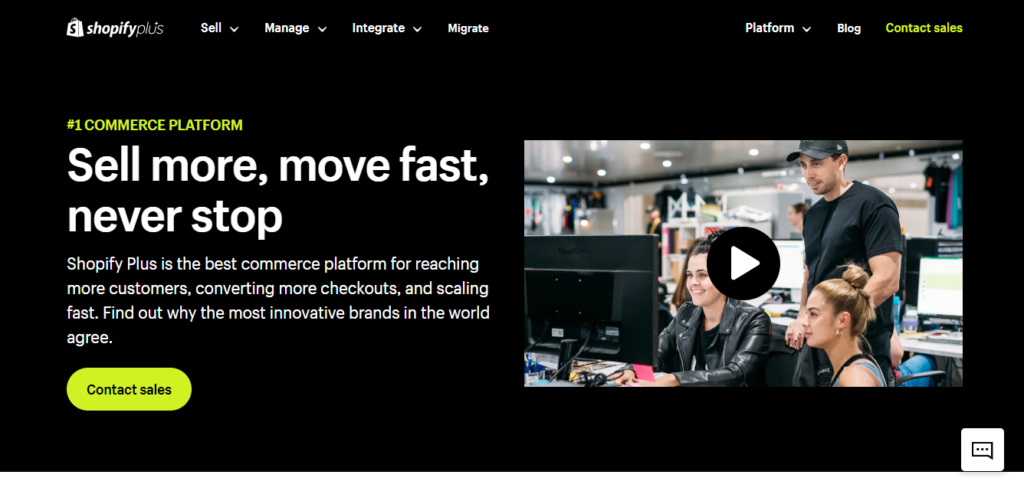
Have you ever wondered why some websites look right? Well, it’s not magic; it’s the art of color. Take a peek at Shopify Plus’s landing page, and you’ll see a palette that’s not just pretty: it’s a design powerhouse. They use a three-colored palette: Black, Green, and White. So, why does this palette work?
Because it’s a power trio: bold black for strength, energizing green for growth, and clean white for clarity, Shopify Plus isn’t just selling; it’s creating an experience through color.
Let’s dive into the details of what makes it more intriguing. There’s no small talk here; it’s all about the enterprise game.
Getting the Invite Right
Ever been to a fancy party?
Shopify Plus’s landing page doesn’t just throw you an invite; it asks you to connect with their sales team. It’s like saying, “Hey, let’s have a chat before we dance.”
Big businesses don’t just click and buy; they want to discuss it. So, Shopify Plus serves up a chat over a cold drink instead of pushing for a quick purchase.
Proof in Numbers
Fancy words sound nice, but numbers hit home. That’s why Shopify Plus goes all in with data. It’s like showing your batting average that’s hard to argue with. They say how much better businesses perform with their help, backed by real digits. So, when someone asks, “Is Shopify Plus worth it?” you’ve got numbers to settle the debate.
Performance
Big shots care about one thing: how well it works. Shopify Plus gets that. Their landing page talks about how their platform performs like a champ. Enterprises want performance, and Shopify Plus hits that note.
So, remember this
Shopify Plus’s landing page is like an exclusive party for the big players. It doesn’t just sell; it chats, shows numbers, and plays the performance card. It’s the ultimate playbook for talking to the big shots.
3. Tesla
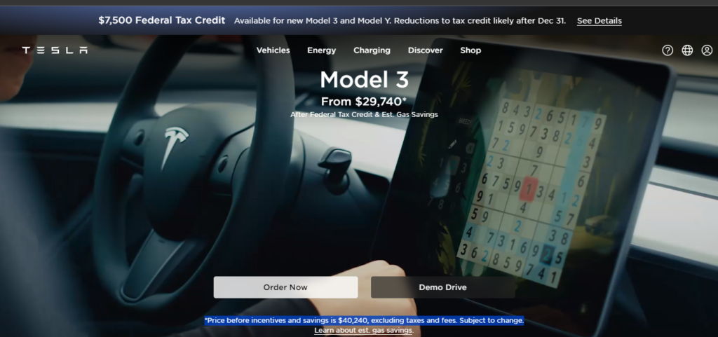
Tesla is another fine example of the best landing page designs of 2023. Tesla’s landing page is a well-designed and effective way to attract potential customers. It is a great example of using language, time-limited offers, and social proof to encourage potential customers to take action.
Let’s dissect the landing page and see what makes customers want to stay and explore it.
Design
Instead of going for static banners or posters, Tesla went in straight. You first see a video of Car playing in the back with two action buttons, ‘Order Now’ and ‘Demo Drive.’ This gives the customer a clear view of what they are buying.
Copy and Language
Tesla kept it straightforward without wasting too much information and writing long copies.
Potential customers are more interested in seeing the product and its pros than knowing the brand is the best in town. Although it works in many cases, in this case, less talk and more action turn customers into conversions.
Transparency
One of the best things about Tesla’s landing page is that it tells the customer immediately how much they will be spending, along with the tax information.
4. Airbnb
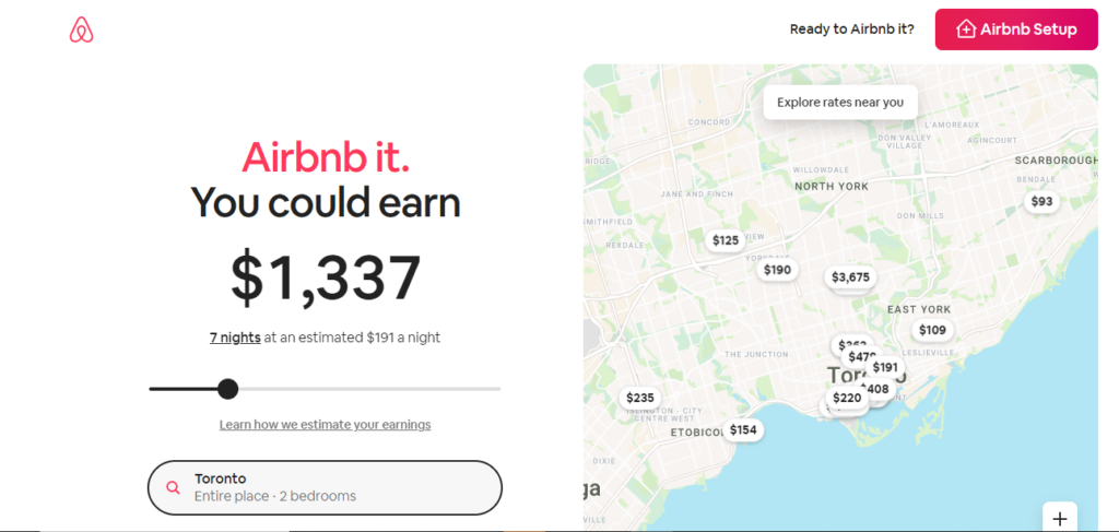
Let’s take a peek at Airbnb’s landing page. It’s a cool combo of good looks and smarts. The colors and design are neat and friendly, working well for folks on iPhones and Androids.
And oh, that button at the top? It’s like a ‘let’s do this’ signal, perfect for making dreams of hosting come true.
But it’s not just about pretty pictures.
When you land here, you see a cool thing
How much you might earn from hosting?
They use your location and home size to give you a hint. It’s like having a helper for your earnings puzzle. And if you’re ready to dive in, that pink button-up is your magic key.
Airbnb loves its community, and they show it. Down the page, they have ‘Superhosts,’ experts who can answer your questions. It’s like having a buddy on your hosting adventure.
This page is like a hosting guidebook. Stories from hosts, advice, and a tool to guess your earnings, it’s all here. So, if you’re thinking about hosting, Airbnb’s landing page is like your friendly GPS, guiding you with style and smarts.
5. Wix
Are you curious to uncover the secret recipe behind the user-friendly landing page of Wix?
Every element plays a role in shaping an engaging user experience, from its eye-catching design to its persuasive content.
Let’s look at Wix’s landing pages and deduce the tactics that make them so effective and captivating.
1. Captivating Illustration
Wix’s landing page isn’t just a page; it’s a creative adventure. The striking digital illustration follows you as you scroll, like a friendly guide.
2. Balance and Clarity
The magic lies in balance. Amid the captivating illustration, there’s room to breathe with white spaces and clear text. It balanced content and graphics throughout the landing page.
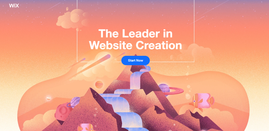
3. Pointing to Action
See that mountain peak?
It’s more than a picture. It points you straight to the main action, urging you to “get started.” It’s like a friendly nudge in the right direction.
4. Colors that Speak
Your brand’s colors are like your voice. Wix speaks loud and clear, reflecting its unique mission and style.
And they even share the color palette secrets for you to follow.
5. The CTA Power
Wix’s “start now” button is your ticket to the show. It stands out in blue against a light orange backdrop, ensuring you take advantage of the call to action.
6. Focus on What Matters
Instead of bombarding you with everything, Wix zooms in on four key concepts. It’s like a highlight reel that conveys the message without overwhelming you.
Wix’s landing page isn’t just about design; it’s about experience. With clever pointers, engaging visuals, and a clear focus, they ensure you’re not just a visitor but a participant in their digital story.
6. Webflow
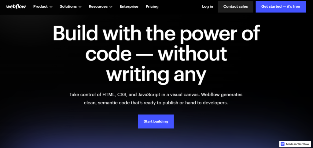
With a single animated GIF, Webflow showcases its power, avoiding lengthy explanations.
What makes this page a winner?
Let’s break it down.
Visual Proof
Instead of just talking, Webflow shows. Their animated GIF lets you see the tool in action. It’s like watching a trailer that convinces you to watch the movie.
Risk-Free Promise
The best part?
They say it’s free, loud and clear. No trials, no strings attached. It’s like test-driving a car without worrying about the bill.
Designer’s Paradise
Webflow knows its audience: designers who might not be coders. The landing page speaks their language with visuals, testimonials, and tailored content.
Bottom Line Takeaways
- Webflow’s landing page is only for some, and that’s okay. It’s designed for designers, and that’s its strength.
- They flaunt their happy customers, building trust with social proof.
- The landing page ends with a bang, displaying what designers can create with their tools.
So, if you want to create an effective landing page, consider Webflow’s playbook. They let visuals talk, reduce the risk, and speak directly to their audience. It’s a landing page lesson in simplicity and engagement that’s hard to ignore.
7. DoorDash
This time, it’s not about hungry customers but about recruiting Dashers who make the magic happen. Let’s take a closer look at why this landing page hits the spot.
Freedom in the Spotlight
DoorDash knows what Dashers love
Independence!
Their landing page shouts it out: “Work when you want.” It’s like saying, “You’re the boss of your schedule.”
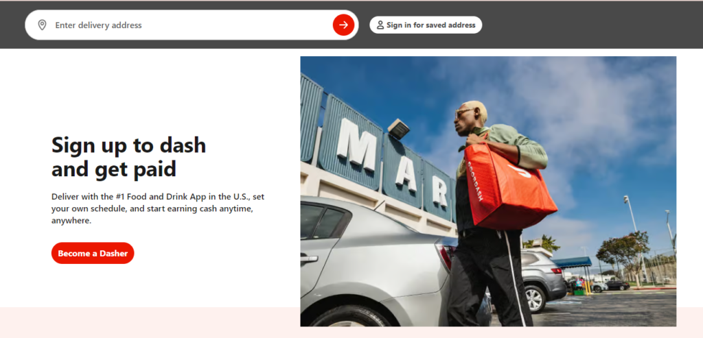
Eyes on Earnings
They dangle a tempting carrot: potential earnings.
While it’s hard to confirm if these numbers are the norm, they’re enough to catch anyone’s attention looking for that extra earning.
DoorDash’s landing page isn’t just about delivering food; it’s about delivering on promises. The page covers all bases, from the crisp call to action to the informative “How to dash” guide.
Plus, the page has a clean design, and balanced colors keep things appetizing for the eyes. DoorDash landing page targeting a specific audience makes it one of the top contenders of the 10 Best Landing Page Designs 2023.
8. RowHouse
Have you ever thought about how a landing page can stand out?
Let’s explore Row House’s page that’s more than just eye candy. What makes it special?
There’s a lot more to learn from this page than meets the eye.
Dynamic Touch
Row House isn’t satisfied with just still images. They kick things up a notch with a video playing in the background. It’s like adding a dash of movement to a painting.
Action in Motion
The video isn’t random; it’s people sweating it out at Row House. It’s like a sneak peek into what the brand is all about fitness in action.
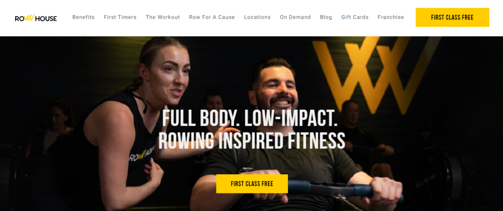
Engagement Up a Notch
If your brand allows, try a video to grab attention. It’s not just about looking; it’s about diving in and experiencing.
Row House’s landing page isn’t a maze; it’s a direct path to sign up. Their focus is clear: get visitors to become customers.
When you create your landing page, remember this: simplicity and speed matter. And if a video fits, it can be the cherry on top.
Like Row House, aim to turn prospects into customers and watch your landing page do wonders.
9. SunBasket
Sunbasket boldly compares its meal delivery service to its competitors. But what’s amazing behind this strategy, and what else makes this page tick?
Let’s explore Sunbasket’s landing page and uncover what sets it apart.
The landing page starts with an offer that’s hard to resist – a percentage off. It’s like a deal that whispers, “Try us; you won’t regret it.”
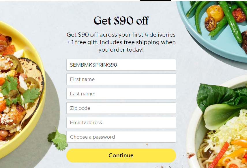
They put their features against their competitors in a clear table. It’s like a friendly duel where Sunbasket shows its prowess. By putting evidence on the table, Sunbasket isn’t just claiming to be better; they’re proving it. It’s like backing up a story with real facts.
Moreover, Sunbasket knows diets are diverse. They cater to different audiences with tailored deals. It’s like offering a menu for every taste. A weekly menu display adds a personal touch. It’s like peeking into a restaurant’s window to see what’s cooking.
It can showcase its strengths against the competition. By offering deals that tempt and information that satisfies, Sunbasket creates a landing page that doesn’t just talk; it delivers. Sunbasket’s approach might be your recipe for success if you’re considering a tall landing page.
10. Curology
It’s not just the flashy graphics or snappy buttons; the top fold sets the stage. Enter Curology, a skincare brand that masters the art of a compelling top fold.
What do you first see when you land on Curology?
A precise copy with a CTA, ‘Unlock Your Offer,’ compelling the visitors to find more. Leaving the customers with a piqued curiosity is also a successful way of making them explore further.
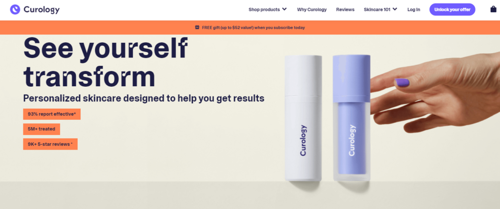
Curology’s top fold is clean, crisp, and under 50 characters. What’s the offer? How does it help them? The message is clear as day.
Whether you’re a Curology fan or a newbie, the message resonates. Custom solutions for everyone.
In the grand list of the 10 Best Landing Page Designs of 2023, Curology’s landing page deserves its spot. It doesn’t just talk about solutions; it makes you feel them.
So, when you craft your landing page, remember this
The top fold is your grand opening, and it’s a chance to make your audience feel what your product brings to the table.
Final Thoughts
Landing pages emerge as powerful catalysts for customer engagement and conversion. These 10 best landing page designs of 2023 are an example of effective online communication. With personalized messaging, eye-catching visuals, and smooth navigation, these pages exemplify how to keep audiences hooked and guide them toward action.
If a stellar landing page and result-driven copy aren’t yielding the customers, sales, or traffic you desire, it’s time to connect with Ad Labz. With expertise in the field, we provide proven strategies to boost your visitor count.